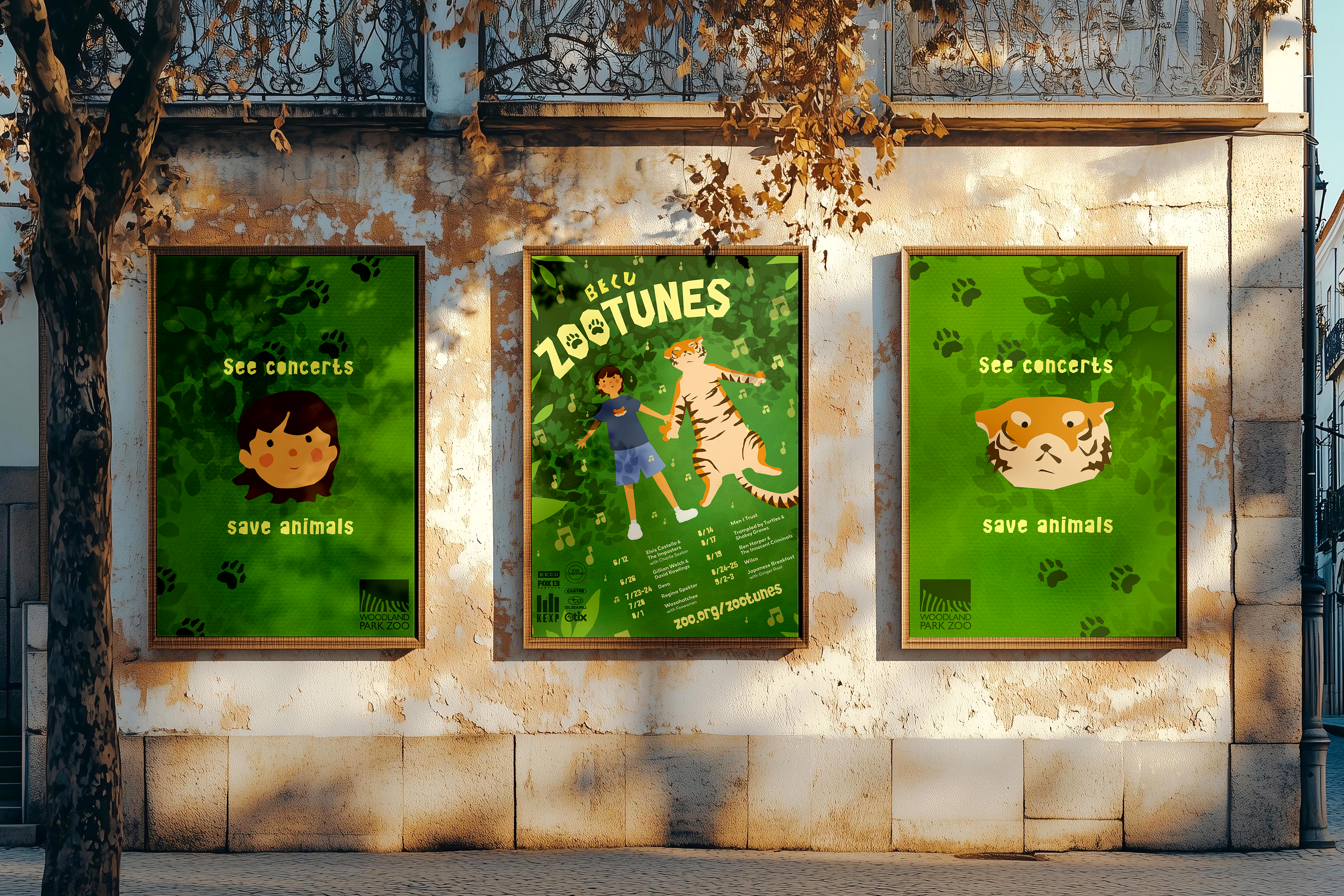
ZooTunes
Reimagining the visual identity of the
BECU Zootunes Concert Series
BECU Zootunes Concert Series
layout | illustration
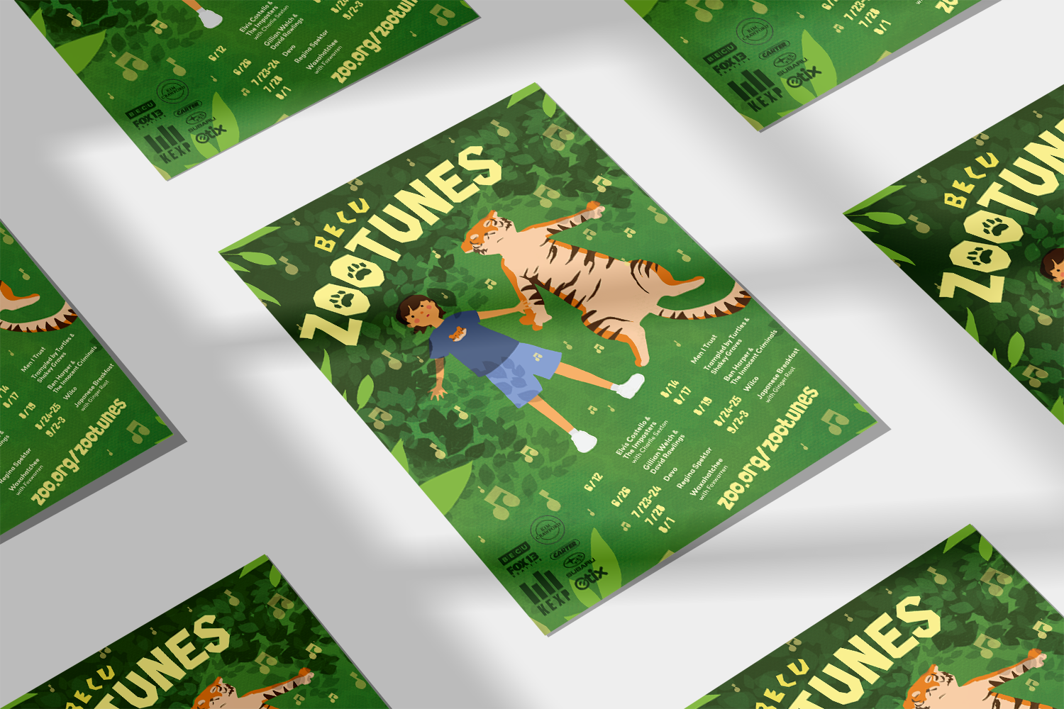
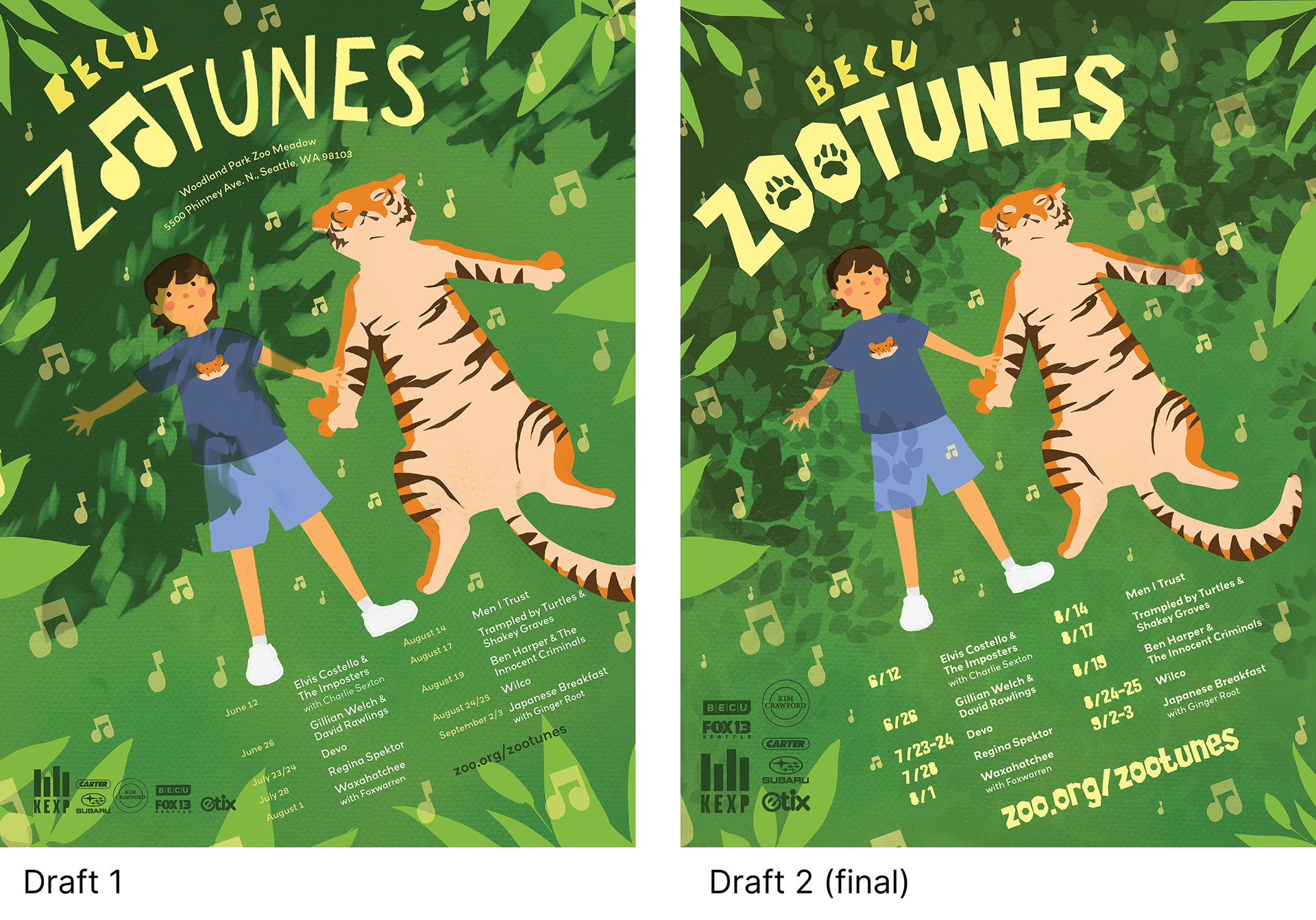
ZooTunes is a family-friendly outdoor concert series held at Woodland Park Zoo in Seattle. The event features artists across diverse genres inside the zoo grounds. Proceeds benefit the zoo’s animal care and wildlife conservation programs.
Challenge
To better communicate the leisure and family-friendly nature that this event has to offer, as well as its charitable cause, the advertising needs a new look that has strong visual appeal.
Solution
The poster takes on an illustration style that is playful and friendly, reflective of the family-friendly atmosphere that Zootunes has to offer. The imagery tells a story of peaceful human-animal coexistence, reflective of the event’s charitable cause. It has strong visual appeal, and the imagery is memorable.
Tools: Adobe Illustrator, Photoshop, InDesign, ProcreateTimeframe: 6 weeks
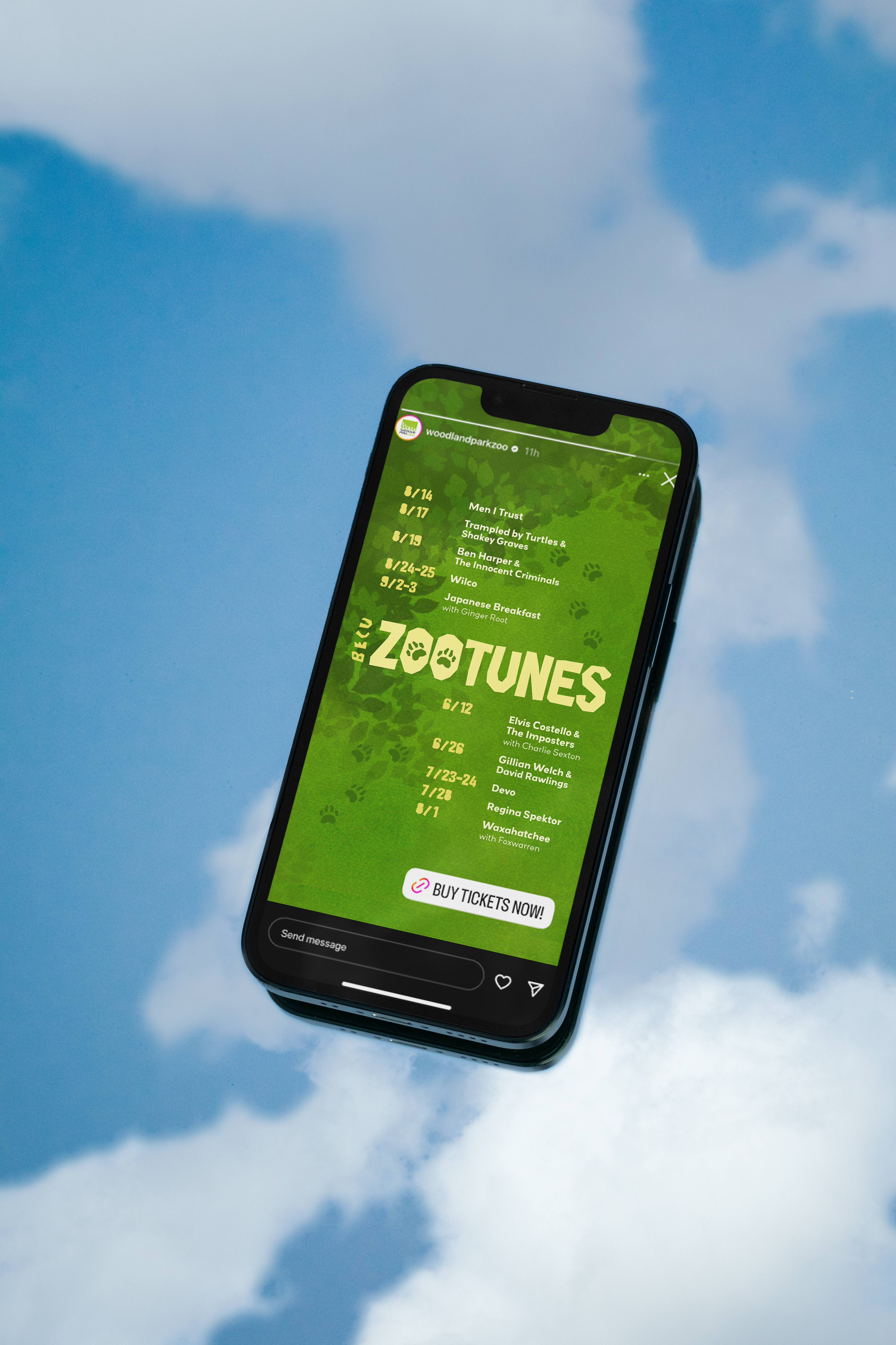
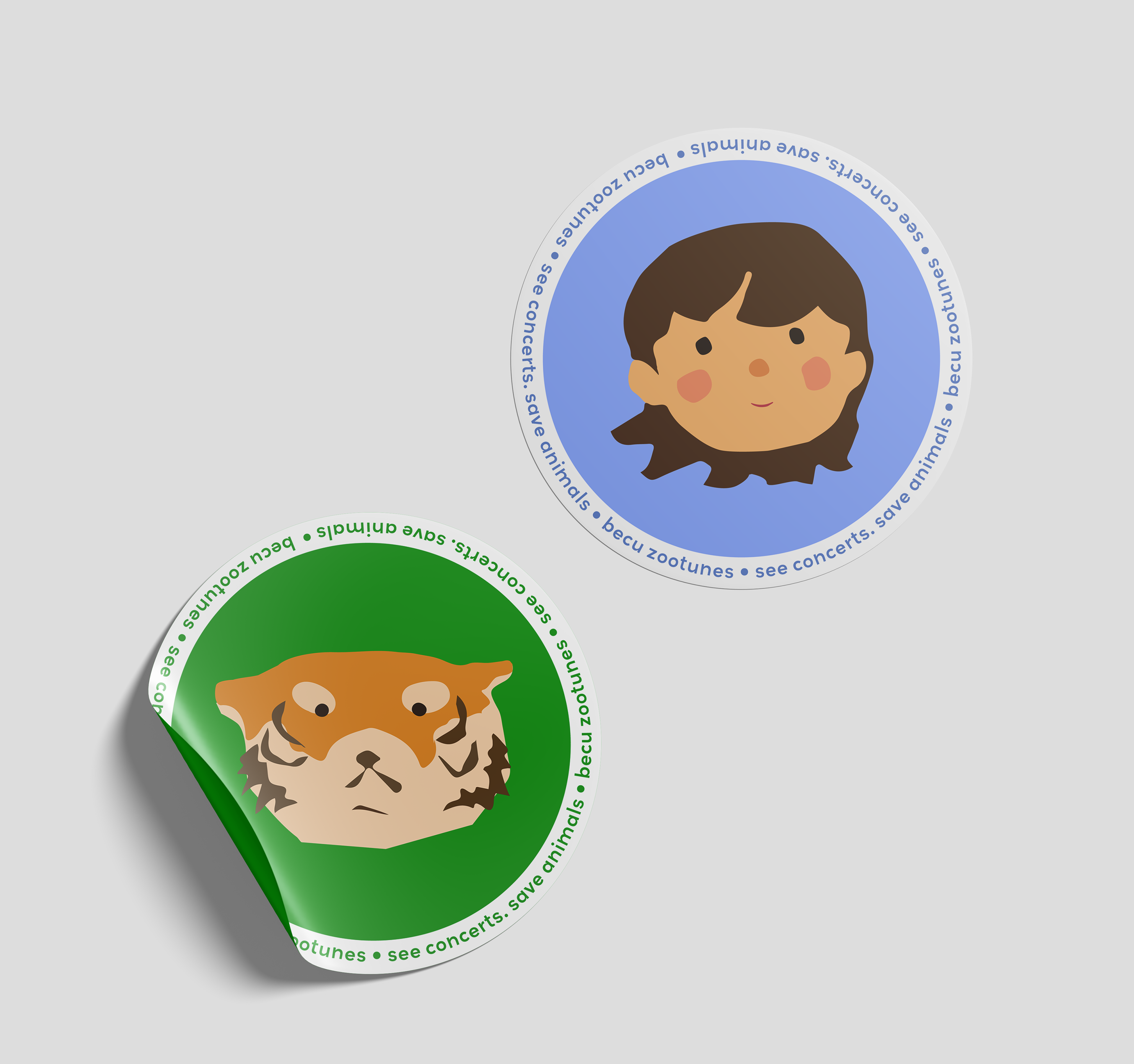
Collateral
instagram, merchandise
Process
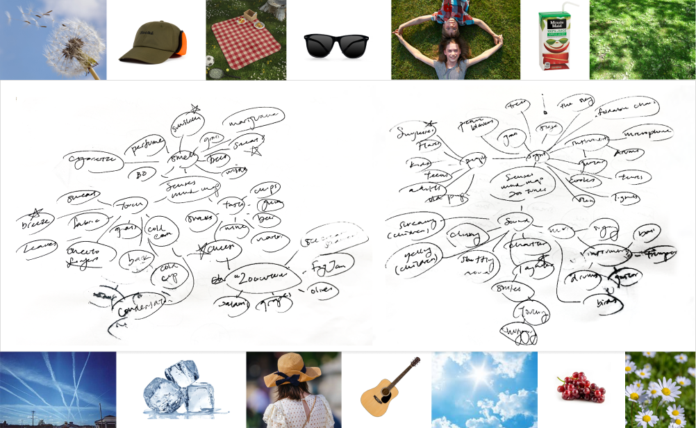
Phase 1: Sensory Brainstorming
To take myself back to what it's like being at an outdoor concert, I made a mind map using the 5 senses: touch, taste, smell, sight, and sound. From there, I took note of things that stood out to me.
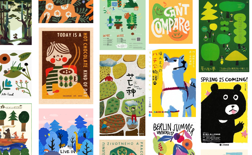
Phase 2: Mood Board!
I found myself being drawn towards the almost picture book esque style that Japanese posters take on. The simple shapes and charming illustrations felt reflective of the family-friendly atmosphere that Zootunes is well known for.
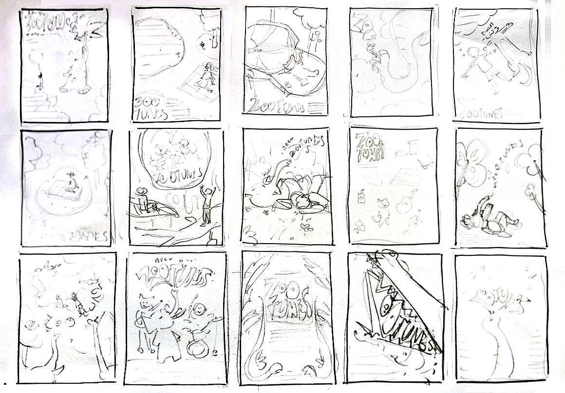
Phase 3: Sketches
Based on the moodboard and ideas I pulled from the mind map, I made sketches where I tested out various compositions and concepts.
Phase 4: To The Digital World!
After determining which idea to move forward with, the concept is brought into the digital hemisphere. Here, I first nailed down the composition and color palette. I dabbled with making my own hand-cut type, then in a revision scrapped it for a typeface I found (Biggy-Cut by Pinsi ART).
In my revisions, I aimed to have more depth, life, and overall impact. I achieved this through more texture and further utilizing the chunky typeface in the lineup copy.