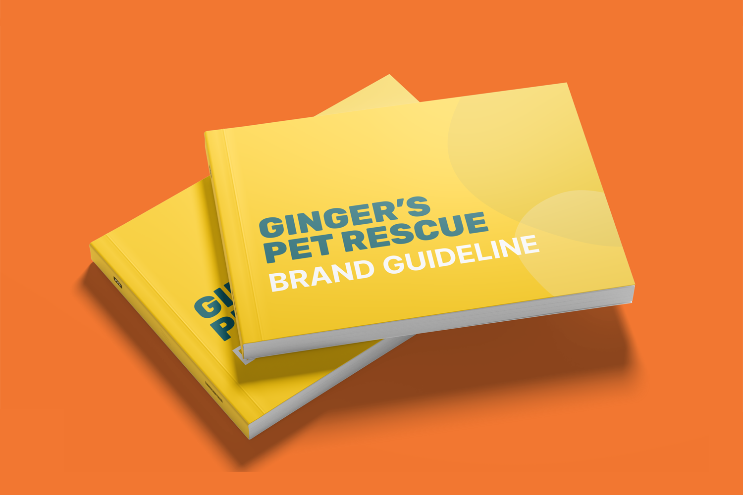
Ginger's Pet Rescue
Rebranding a local Seattle dog rescue
branding
Ginger's Pet Rescue is one of the largest non-profit pet rescue organizations in Washington state specializing in saving Death Row Dogs.
Challenge
The brand lacks consistency across platforms from social media, website, and in-person events, making it difficult to present a unified and recognizable identity.
Solution
We created a brand that is visually friendly and aims to evoke a sense of warmth, reliability, and community spirit at the core of Ginger’s Pet Rescue. The goal is to create a cohesive experience across platforms through a refreshed visual identity, making the brand more recognizable and aligned with the organization’s mission.
Timeframe: 11 weeks
Collaborators: Eric Galindo
Flip through our guidebook by scrubbing/clicking at the edge of the pages!
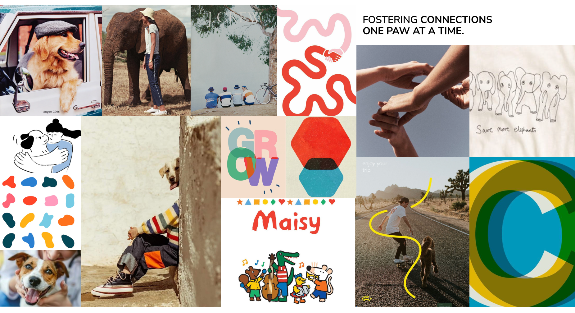
Concept Board
Once we established our brand character (compassionate, reliable, united), we fleshed out a concept board with visual elements reflective of these values.
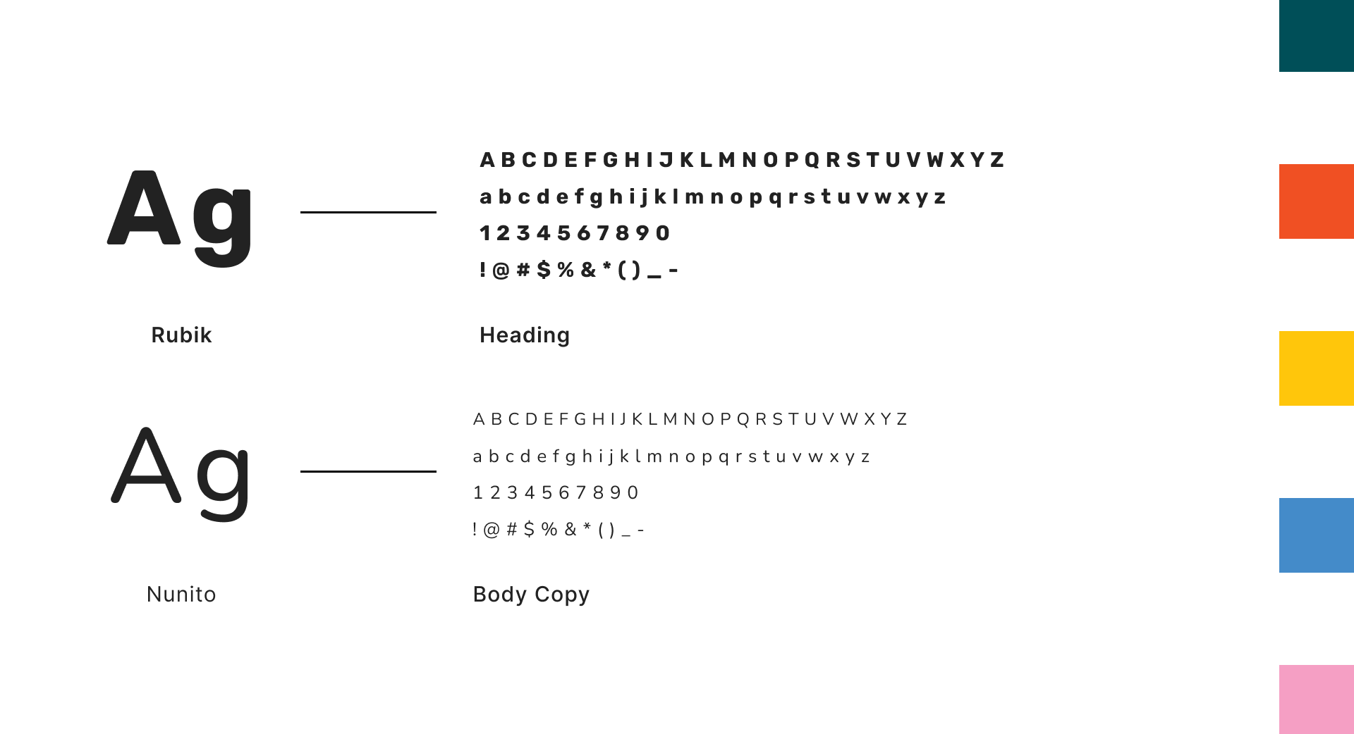
Color & Typefaces
With our brand character in mind, we opted for clean, structured typefaces with rounded corners.
For color, we used a blend of warm and cool tones; warm hues like red, yellow, and pink reflect the emotional bond between people and pets, while cool hues like blue and deep green bring a sense of trust, stability, and authenticity, reinforcing our dependability as a rescue.
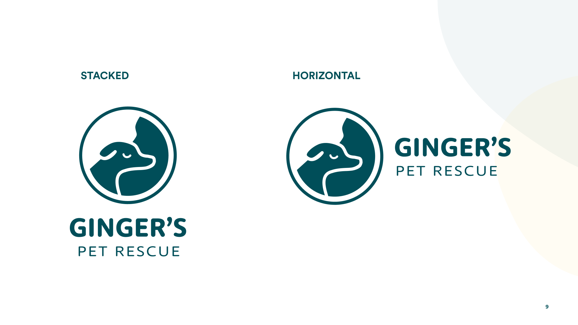
Logo
The logo features a silhouette of a dog resting its head on a person’s shoulder, symbolizing trust, comfort, and mutual care.